Holiday Dates
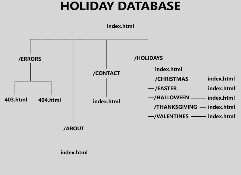
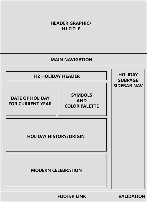
Sketches and concepts
The following are the approximate wireframes and diagrams that went into the planning of Holiday Dates:
Our origin and history
When the site was in the "Ideas and Concepts" stage, one of the ideas I brainstormed was a Pinterest-esque site that users could submit and share Thanksgiving and Christmas meal and decor ideas. However, I thought that idea was too simple and not warranting enough pages for a full website. The next idea was to make the website exclusive to a single holiday and expand to origins, celebration traditions, and other areas of the chosen holiday. However, that idea also failed due to little amount of content on each page. Finally, the idea that became the site you see before you is a concept of the second idea, but with a focus on all holidays throughout the year.
Intentions and goals
The target audience for Holiday Dates is quite simply: all people who celebrate holidays (religious, secular, regional, local, etc.) frequently. With how busy life can get, one who is included in this target audience would most likely want/need a one stop place to information about their chosen holidays. This is the goal of Holiday Dates: to inform and educate. The message of the site is that with so many holidays to plan for and with instant information at your fingertips, Holiday Dates is here for you! The design of the site is kept simple and straightforward for easy navigation and to avoid confusing/irritating the user and potentially leading them to leaving prematurely.
CTAs - Call(s) to action
The main call to action of the site is the red headings of the holiday subpages. These headings call to the user: "HEY! Look at this!" and catches their eye as the page opens. Another CTA are the hyperlink states and the the navigation colors. The main content body of the page has red links that change to dark green while hovered over and then gold when active. The footer mostly stays with this color scheme with dark green being the idle color, red being the hover color, and white being the active link color. The navigation keeps the color white for its font and only changes to lighter hues of green for change states. Each of these CTAs supports the design by staying consistent to the color scheme: Dark Red, Dark Green, Gold, White, Black, and Light Grey.
Design choices
When deciding on layout, color scheme and typography, my goal was to make sure the pages and information were easy on the eyes and brief. If I found walls of text, I strived to break them up into easy to read and understand paragraphs. The layout is an example of the popular grid-based layout. This layout makes elements and content look ordered and well put together. With some initial setup of CSS, a column assigned a value of 50% for width will truly be 50% of the row it is contained in because the grid model takes margin into account when calculating width.
When considering ideas for a color palette, I tried to make the site look festive without overly vibrant hues and saturated colors shocking the users eyes. While the color scheme is seemingly geared toward Christmas colors, this was the main intent. When the word "holidays" is said, most minds jump to Christmas or to the end of the year around December. While Christmas is not the only holiday, it is the most recognizable.
The typography was a simple choice of the Segoe font family. Segoe is a standard sans-serif font and is easy to read (going back to 'easy on the eyes' for design). The only part of the site that did not use this font family was the H1 in the header. That H1 uses the Google Font 'Kaushan Script' with cursive being the default fallback. This font gives a natural feeling of writing with an inked brush and makes a page title appear to be handwritten rather than simply typed.


